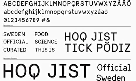
Countries have national anthems, national dishes, even national dances – but the Swedes have taken their cultural identity one step further by creating their own typeface, one inspired by Swedish signs of the 1950s and named “Sweden Sans”.
The brief was to replace the various fonts used by different Swedish government ministries, agencies and corporations with one integrated visual brand identity that would represent the country to the world in a “fresh and dynamic way”.
“Aesthetics are very important in Sweden and we have a long tradition of great architecture, furniture and design – so this was the natural next step,” said type designer Stefan Hattenbach of Stockholm-based Söderhavet, who worked on the font. “It was a big responsibility to be representing our country, but we were really proud to be asked.”
The starting point was the Swedish flag, the yellow Scandinavian cross against a blue background that has been used since the 1600s. “We started to think about how it would work with different typefaces, then started mood boards with different fonts and pictures – especially of old Swedish signs we’d seen from the 1940s and 50s,” said Jesper Robinell, Söderhavet’s head of design.
Then, they started sketching; Robinell, to the dulcet strains of modern electro music and Hattenbach to disco and Bob Marley (“Bob’s always good to create to”).

“We worked on it for about six months, really going into the details, to create Sweden Sans – a modern, geometric font,” Hattenbach said. The result is a basic sans serif font with some modern tweaks.
“Like the Q, for example,” Hattenbach explained, “its tail, which would normally trail off to the right, points straight down instead. I think our Q is really nice.
“We have an expression in Swedish, lagom, which means ‘not too much and not too little’, something in the middle that means you’re content. We Swedes are happy with that. And lagom is what we’ve aimed for with Sweden Sans.”
So what do they hope the response will be? The answer is similarly lagom: “We want people to just appreciate the identity as a whole,” said Robinell. “It’s all about Scandinavian minimalism. If they notice the typeface too much, it hasn’t worked.”
But the rest of the world has taken quite a lot of notice with the team at Söderhavet now working on similar briefs for other countries.
“We can’t name names,” said Hattenbach, “as the projects are still in their first phases, but we’re currently ‘in discussions’ to do much more nation branding in future.”


Comments (…)
Sign in or create your Guardian account to join the discussion